Even respected chairs can feel completely wrong to the person using them.
Fit is personal. Review consensus cannot remove the need to try the product.
Independent DTC portfolio project
Turning an overloaded feature category into one clear product argument.
An independent concept created to demonstrate process and execution. Product details and commercial terms are illustrative.
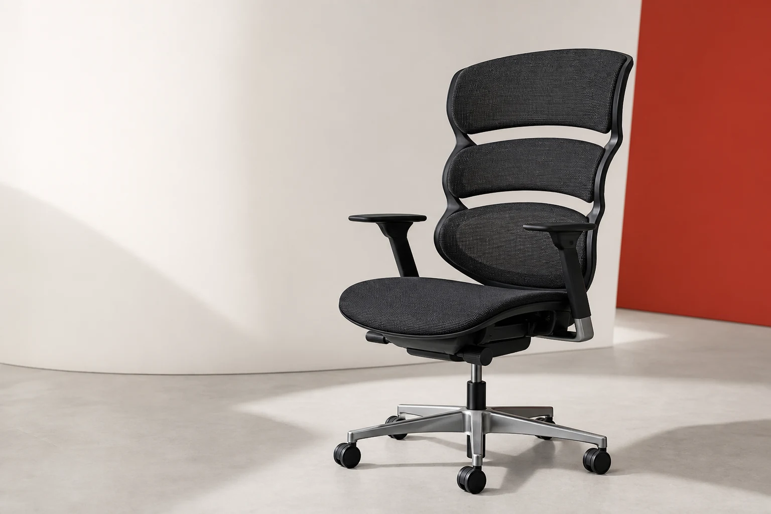
Portfolio brief
The work was not to invent another list of ergonomic features. It was to build a sales argument that could survive a sophisticated, sceptical buyer.
High consideration products carry two burdens. The page must make the difference visible, then make the purchase feel safe enough to evaluate in real life.
That meant treating positioning, product mechanism, visual explanation, price defence and risk reversal as one connected system.
Defend a £1,195 price without borrowed prestige or inflated value claims.
Reduce the fear of buying the wrong chair without pretending fit is universal.
Make continuous support easier to see than a conventional specification list.
What buyers actually worry about
Months of comparisons do not necessarily produce confidence. They often produce a longer list of reasons a chair might be wrong.
Even respected chairs can feel completely wrong to the person using them.
Fit is personal. Review consensus cannot remove the need to try the product.
More adjustment can create more setup work and more parts that feel loose.
Feature density is not automatically experienced as quality.
At a premium price, build, delivery, returns and warranty become part of the product.
The commercial offer must carry as much confidence as the ergonomic story.
Signals synthesised from current product pages, independent reviews and OfficeChairs buyer discussions. Full links appear in the source note.
The strategic break
The useful opposition was not cheap chair versus expensive chair. It was static fit versus support that stays present through movement.
More controls. More positions. More responsibility placed on the sitter.
Three linked zones that respond together while the work changes.
Make the reason visible
One name gives the product argument a centre. One visual explains more than another paragraph about comfort.
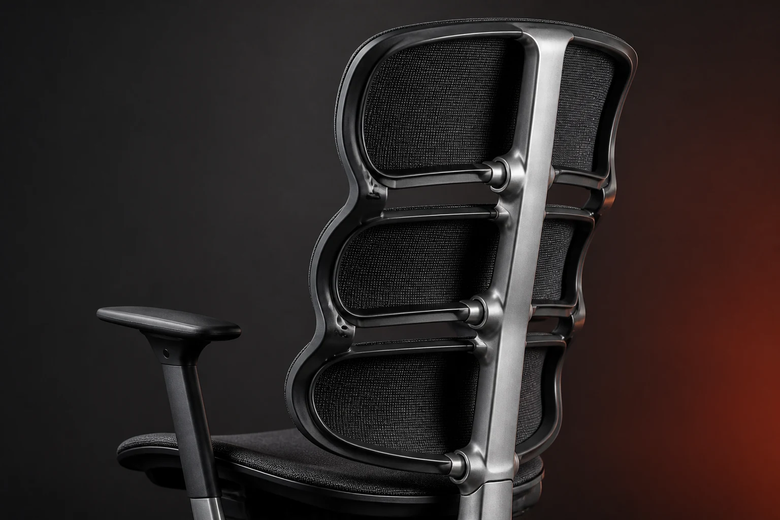
The segmented back is designed as a connected structure, not three isolated cushions. As pressure changes, each zone can give locally while the central spine keeps the response coordinated.
The purchase argument
The page earns the purchase in sequence. Each section has one job.
Work is movement, not one frozen seating position.
A chair tuned to one position can lose contact when that position changes.
Linked flex zones can respond without repeated manual resets.
Materials, delivery and service can justify a premium beyond feature count.
A home trial is the honest answer to personal fit uncertainty.
The buyer can now judge the product on use, not on a specification gamble.
The final expression
FORM 01 follows the way your body moves, so support stays with you without turning every workday into a setup session.
The line assumes a buyer who already knows what ergonomic adjustment means.
Most chairs wait for the sitter to find and change a control.
“Before you do” creates the question answered by the Continuum Frame.
No pain relief, posture correction or universal comfort result is promised.
Decision path
Completed deliverable
The finished sales page uses a distinct consumer brand system, original product imagery, working selectors and mobile purchase controls. It is deliberately separate from this strategy document and from the ScopeSignal product world.

Research note
This case study demonstrates research, strategy, copy and art direction. ASTER FORM 01 is an independent concept, not a commissioned client project. The product, price and policies are illustrative. No sale, customer result, laboratory test or clinical outcome is claimed.